Tuesday, March 31, 2009

More VIX Tattletales

Despite yesterday's distinctly negative performance, there were a few intraday trading setups using the VIX that yielded a few dimes and a quarter into the close.
On the 2 minute Qs chart above I've tracked the VIX trend with white heavy lines and the Qs price trend with orange lines.
Just for comparison I've added the buy sell signals generated by the SMA and MACD signal line crosses in the mid-panel and highlighted an obvious congestion area with the white circle.
While not foolproof, using the VIX is certainty useful as a confirmation for other technical triggers and, just as my cardinal trading rule is to never trade against the NYAD, a secondary rule would be not to trade against the VIX.
These rules apply to the Qs and the other index based ETFs like my mini-basket. Individual stocks may not conform to these rules.
As mentioned previously, the dynamic scaling issue must be recognized when using the VIX overlay and each day must be tracked on it's own, hence the suggestion of using 2 and 3 minute bars in lieu of larger time frames.

Monday, March 30, 2009

Qs Pivot Bands and Impulse


Here's the latest on the Qs Pivot Bands and Pivot Impulse indicator. It's just another way of looking at the data fields based on the value of the weekly pivots and the weekly change in the R2-S2 range. So far it's been a valuable tool for keeping us on the right side of Qs momentum and has provided the baseline for the Dirty Dozen SD reversion study.
Based on Friday's study the probability skew is clearly to the downside, with the LR75 mean providing the first line of support.

Friday, March 27, 2009

Friday Outlook

Coming into the open today my little ETF basket are all hugging the upper LR75 channel band. I've stepped back from the typical LR30 perspective as that channel got a good-bye kiss 10 days ago from the entire basket.
While the action over that time frame has produced 45 degree price ascents in the basket, if the market is going to pull back, this is a likely high pivot. Friday's Qs have about a 70% percent of ending down over my recent 16 month backtest period, so there's an extra little bias favoring the downside.
Traders that focused solely on overbought RSI(2) levels have clearly been frustrated as those levels have persisted for 10 days or more in each of the basket and are, in fact, still holding.
The MACD indicator panel is more suggestive of an impending retracement, but is also divergent with recent price action.
On an intraday basis trade activity over the last few days has been rather weird to say the least as extended periods of price consolidation are dramatically catapulted in one direction or another without apparent catalysts. This is one reason the VIX remains in the 40s despite the recent market surge.
Finally, don't overlook Tuesday's Bucket List post.

Thursday, March 26, 2009

VIXEN Redux

Here's yesterday's VIX action with GE, one of my ETF trading outliers. The afternoon VIX cross at 13:25 was a great tell that price was about to fade and the flattening and reversal of the VIX starting at 15:00 was a good tell that a bounce was about to ensue.
In the lower technical panel of the chart, the best indication at 13:25 that GE was still going down was the continued downslope of the MACD and SMA signal lines. They also did a good job of signalling the late afternoon rally when they crossed to the upside at 15:15 and the histogram crossed over the zero line.
Bill had a good question on yesterday's VIXEN post and I recommend reading that and my response if the VIXEN has any interest for you.
The dynamic scaling thing is an issue to be dealt with and Jeff Pietsch over at Market Rewind has given me some areas of research to pursue in order to lock this thing down in TS2000i, which, as it turns out, is a bit behind the algorithmic curve from TS8.4. I may have to finally get 8.4 and join the ranks of the up-to-daters, if only for backtesting purposes as I much prefer the look and feel of the Schwab platform for actual trading.

Wednesday, March 25, 2009

VIXEN daytrading

Contrary to the contention I made several weeks ago that the VIX was only useful for trading on daily bars, here are 2 examples of using the VIX/price cross on intraday bars to forecast short term momentum. The VIX (close) is displayed as a continuous white line on both charts.
Above is Monday's action on 5 minute bars, below is portions of Monday/Tuesday's action on 2 minute bars. On the upper chart I've also highlighted with white arrows the midpanel technical short term buy setups to see how (or if) they correlate. Clearly, the midpanel 3/7 SMAs and the Monday's early VIX/Price cross were great prognosticators of what was coming down the pipe for the rest of the day, whereas the late afternoon breakout was clearly forecast by the failure of the MACDs to turn down.
The VIXEN studies are obviously a work in progress, but I'm certainly encouraged from my initial forays that the VIX/Price crosses can provide useful intraday guidance in both trending and trading range environments.
I've previously mentioned my confidence in intraday NYAD/Price divergent trades using GE as an example and I typically maintain a NYAD overlay on the intraday price charts. My problem now is determining whether it is more indicative to have a NYAD or a VIX overlay on the charts. For the time being I've just duped my main trading screen . . . setting one up with the VIX and one with the NYAD to see how trades set up.
More to follow as I pursue the VIXEN coding and backtesting project.

Tuesday, March 24, 2009

A Trader's Bucket List

So much for the resounding negative market prognosis posted on the Weekly Update.
Hey! Stuff happens. The trick is to avoid having your trading account become collateral damage when the technical signals implode.
Luckily I still had some upside breathing room in my hedged positions and added some GE and Qs longs mid morning, which I exited at the close. Gotta go with the flow and with the NYAD on a tear, the odds were clearly with the bulls.
On a side note, a while back I enjoyed watching The Bucket List with Jack Nicholson and Morgan Freeman, especially the part where Jack expounds on his 3 cardinal rules of life. . . one of which was to never pass up a restroom . . . the other 2 rules. . . well, you'll just have to see the movie.
With a similar view towards the markets I suggest the following possible rules for traders:
1. Never underestimate the market's ability to surprise
2. Always expect any such surprises to be contrary to your current stance in the market
3. Be prepared and willing to quickly change your market stance
I'm sure my clever readers could come up with a rules list with considerably more pizazz, but these are a good start (IMHO).

Monday, March 23, 2009

VIXEN

Here's a little cleaner look at the VIX/Price cross I mentioned in the Weekly Update. The VIX is the yellow line tracking almost inversely to the green price candles of my little ETF basket. I've thrown the LR75 channel on just to check for a possible signal confirmation and it's noteworthy that most of the VIX crosses occur on or very near the LR75 channel mean or channel boundaries.
The differential in price scales of the VIX and various ETFs and stocks does present some problems in terms of coding a testable (and tradeable) system into TS. The fact that the VIX trades basically inverse of the ETF price also presents some added wrinkles that need to be ironed out. I'm working on a z-score type analysis in an attempt to accomplish that goal, but have encountered a few problems along the way, so no publishable code or performance report yet.
Speaking of problems . . . . my ambitious goal of setting up a real time trading and chat room for the Qs has hit a brick wall. Keeping in mind that this is a free site, the expenses involved in setting up the technology to activate and maintain such a site are turning out to be far beyond my initial expectations and above a level I'm willing to underwrite.
I've been talking to Schwab in an effort to let my viewers access limited real time charts on the StreetSmartPro platform without actually opening accounts. Since I'm not a Schwab employee or contractor however, Schwab is currently pushing back on that idea, since they have no control what an ole geezer like me might do or say in the trading room. The next best thing I could do (without any additional technology) is to post hourly charts of 2 or 5 minute bars with a running commentary. This is not exactly what I had in mind and so my research on this front continues.

Saturday, March 21, 2009

Weekly Update + VIX cross

I first mentioned the VIX/price crossover back in January. Although the signal appears infrequently, it turned out to be a great tell for last week's price action. I've turned the VIX overlay on for this week's update to show how it played out. The working premise was that once the VIX chart crosses the price chart, price momentum will continue for a few days in the direction of the cross before reversing.
There are a number of ways to use the VIX cross. The simplest is to just trade the cross (having reviewed previous performance of the cross on your own trading targets). Another is to apply the VIX cross to a basket of stocks/ ETFs to see which are the leaders and which are the laggards. This is the kind of logic behind the 3 Finger studies and displays the "second mouse gets the cheese" tactical approach that I favor for my own trading. While seldom hitting outlier highs and lows, it's a low risk trade that very often captures the sweet spot in the momentum cycle.
The Telechart platform allows users to simply set up the VIX as a comparison overlay chart in either candles or as a line. I can accomplish the same display with Schwab StreetSmart Pro, with the relative scale of the VIX and the price charts converted to a common base. Getting this type of display in TradeStation is a bit more complicated and if any of my TS followers care to jump in and post the setup, please chime in.
I'm currently working on an intraday application of the VIX/price crosses that I call VIXEN. More on that next week.
As far as this week's ETF basket charts signals go. . . they're all distinctly bearish.
All ETFs coming off uber overbought LR30 upper channel band. First stop = upper band, next stop down is the channel mean.
MACD is negative and its 3/7 MA momentum signal (MAs are on top of the MACD, not stand alone) are negative with bear crosses on all 4 ETFs.
RSI(2)s are similarly coming off 99% overbought levels.
(IMHO) (For swing traders) If not short, safest to be fully hedged at LR30 channel high band levels, or flat and waiting for a re-basing.

Friday, March 20, 2009

More on System Re Alignment

Just a little clarification. After yesterday's post I received a few emails concerned that I was abandoning my dirty dozen systems approach to the markets. Rest easy gentle readers and dedicated system traders. . . such is not the case and I apologize if I left that impression.
What is the case is that I'll be reviewing the ongoing performance of each dirty dozen system relative to the others to develop a kind of revolving pecking order of reliability. I expect this ranking to be dynamic and will adjust the weighting of each system on a monthly basis to create a kind of exponentially biased system approach. I would realign the systems more frequently, but many of the systems only trade weekly, biweekly or monthly, so this seems unproductive.
When I originally started the Kit of Parts and systems basket studies back in May of 2008 the stated goal was to reduce risk exposure ( drawdown, max consecutive losers) by diversifying. In this case diversification was not to be accomplished in the traditional means by trading a wide variety of stocks and ETFs, but by trading a variety of non-correlated systems against a single ETF, or a very small basket of ETFs.
In the constant flux of trading range and trending markets the applicability of various system approaches will inevitably vary, which is why I developed multiple non-correlated systems. The trick is not to fooled into reading too much from the system performance reports. Either it's working or it isn't. End of story.
After almost 25 years of trading one thing I've learned is that market dynamics are constantly changing. Traders who adapt their methodology and strategy and embrace those changes typically fare much better than those who resist new ways of looking at things and instead stubbornly cling to what's worked in the past. I'm just trying to practice a little proactive tactical adaptation in an effort to increase my changes for survival.
As I mentioned yesterday, I personally find it "easier" to read what's coming down the pipe on intraday charts than on the daily bars. That's just my brain's hard wiring at work (and the risk management gnome inside my head talking). So what I need to do going forward is to capitalize on how and why that intraday time frame paradigm works so well (for me) and why the daily bar time frame is a bit (frustratingly) lagging.

Those of you who've followed me for a while know that, in fact, 80-90% of my trading is daytrading, augmented with some swing trading focused on fixed risk butterfly positions and short term (less than a week) momentum plays.
Why would a risk aversion nut like myself even bother with longer time frame trades in these volatile markets? Because, my friends, that's where the big money is. Unfortunately, that's where the big risk is also so the trick is to either hedge your bet (option spreads, covered calls, covered puts, etc.) or find a REALLY RELIABLE systems approach. My on going goal has been development the later while I practice the former. The search continues.

Thursday, March 19, 2009

When Good Indicators Go Bad

What? No charts?. . . . No visual aids today.
Yesterday Woodshedder posted a thought provoking little piece in which he lamented the lagging performance of his much tested and newly deployed trading system. The exact rules of the system are proprietary so I can't indulge my usual fiendish glee in deconstructing the system and applying my own BZB spin. That's not a criticism, just a fact. Each system developer owns his ideas and decides how to share them. I'm perfectly happy revealing the source code for my humble little systems since I suspect the trading volume in the Qs and GE stimulated by my BUY or SELL signals is not going to skew market momentum one smidgen. That's just my approach.
But I digress.
My point is that I too have noticed a recent flagging in the performance of many of the dirty dozen systems that is reflected in the flattening of the system equity curves. I've mentioned this flattening in several previous posts, without providing a coherent explanation of the phenomenon.
Unfortunately, I still don't have a defensible argument for the flattening equity curves but it's a topic that has consumed much of my time recently as I seek to explore probable causes.
What I have noticed recently is that the dirty dozen systems applied to daily bars tend to UNDERPERFORM the same systems on shorter time frames, including 60, 10 and 2 minute bars. Within this context I also have to caution that the various system inputs must be re-optimized when used in conjunction with intraday time intervals. Sometimes the adjustment is minor, sometimes a bit more dramatic.
While I may be accused of curve fitting the backtest data to create a better looking performance report, I'm going out on a limb and argue that the differential volatility of the various intraday time frames versus the daily bars gives credence to this re-balancing approach.
I know from emails I have received from several active trader viewers that my observations about the systems performing better intraday than daily are supported by their own trading activity.
So what to do?
For my own part, I continue to focus on what works (for me). That means concentrating risk exposure on intraday bars using my reliable stable of signals including the pivots, the NYAD, the MA crosses and the parabolics.
You might call that getting back to the basics, and while I've been able to accumulate a nice little equity bounce with this latest rally, I'm concerned about the sustainability of the surge and am therefore pulling back to my daytrading mode for the near term while I begin a new round of system testing and refinement.

Wednesday, March 18, 2009

60 Minute Man

Here's a screen shot of a refined MACD signal line using 60 minute bars.
On the top price chart the 8 and 16 MAs and the parabolics are displayed.
We know the 7/14 EMAs work best for the Qs, but this is GE and the default 8/16s work better here. It's important to identify the "pulse" for each stock or ETF that you trade, which can be a time consuming endeavor and which is one big reason why I trade only a limited basket of stocks/ETFs that I've carefully studied and backtested.
The mid panel contains:
MACD histogram with classic 12,26,9 settings.
MACD 3,16
MACD 5,20
And SMAs of 3 and 7
Note how SMAs crosses of the MACDs have produced nice trend trade triggers and kept you on the right side of the market when a smaller time frame view would have kicked you out.
An important screen to monitor on an hourly basis in conjunction with the NYAD if only to track on-going daily momentum.

Monday, March 16, 2009

Qs Pivot Bands Update

This is an update of the March 10th post on the Qs Pivot Bands. Keep in mind that these are weekly bars displayed. . . not dailies. What's interesting here is that the Qs range bands are expanding in contrast to the contracting VIX (not shown). So volatility is correlated to the bands not only directly, but inversely also.
Note: The data date on the charts should read 3-13-09, not 3-11-03.
The weekly impulse signal reflects the relative overbought levels suggested by the ratio of the MA3 and MA7 of the range. In a previous study this indicator was shown to have a reliability of about 70% when applied to daily bars, a performance level that I'm not that happy with and so I'm continuing to work on refining and improving the signal line.
Today's action promises to be a bit frustrating as the DIA, IWM and VIX are all in the green, while the Qs are proportionately down. Hey!, it's a mean reversion pairs trade.


Sunday, March 15, 2009

Weekly Update

Well Sir, we had a nice rally this past week that has my little ETF basket firmly in overbought territory. Per the LR30 channel, XLF is leading the pack as daily volume peaked on Wednesday and faded down into Friday. XLE and IWM are now at the LR30 channel mean, while the Qs have actually only risen to the lower channel band. So do we buy the Qs and sell the XLF at this point?
I've added back in the VIX overlay (red line on each chart to show the impending price/VIX crosses (already a done deal on the Qs) and in the past this cross has been good for at least a couple days of momentum contra the VIX . . . meaning the rally still may have some legs as we go into uber-overbought territory.
Below are the same charts with weekly bars. . . reflecting a little different outlook with the Qs and XLE riding a downsloping LR30 top band and the IWM and XLF clinging to the mean. The MACD/MAX technicals are all neutral. Hey!. . . nobody ever said trading was easy.
My GE, MSFT and Qs longs from last weekend worked out well, although heavy selling pressure in MSFT persists so I've just switched over to fading the ATM calls at the downturn of each intraday rally bounce (so far, so good). Bottom line, I banked some bucks and am now covered going into this week's expiration.
By the end of the month I hope to complete the new blog format focused on the Qs (and perhaps IWM) Dirty Dozen performance matrix.
In addition, and more exciting (to me), I hope to launch a live trading/chat room in conjunction with another active day trader. To start out with, I would moderate the room one day a week and focus on daytrading the Qs with streaming live video of the trading screens I'm watching and the various signals and setups that I'm seeing develop. Depending on the level of interest, this format could be expanded to include other traders using focus different ETFs, technical indicators and trading setups. For now, just getting the technology together is the big push along with finding the free time to put it all together.

Friday, March 13, 2009

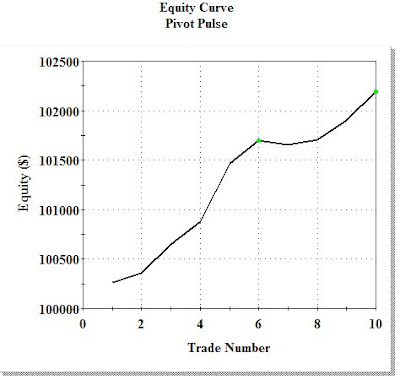
Pivot Pulse system


This is the latest iteration of the pivots study. Basically' I've recycled the MAMA study using the pivots PP fulcrum in lieu of either high or low values. The results are rather impressive to say the least, with the short side trades being 100% reliable.
I know, I know, the study only delivers a total of 10 trades over 16 months so I can't expect a Nobel prize in system development for this (otherwise) little gem.
Nevertheless, the goal of these studies is to explore algorithms that yield high probability results, in that respect the pivot pulse delivers. The next logical application of this system is ? (this is a test). . . applying it to smaller time frames such as 60 minute and 10 minute bars to see how (if) the performance results hold up.
And, as I've mentioned previously, there are multiple ways to utilize these systems . . . not only as trading signals, but as trend indicators and signal confirmation for other non-correlated systems.

TS2000i code is shown below. I've created a number of variables to display the code parameters as it makes it somewhat easier to see what's going on. For use on smaller time frames, expect to re-optimize the inputs to reflect increased intraday volatility. If we remove the MarketPosition clauses from the order line "If" statements the system essentially morphs into a stop and reverse format with the fixed bar exits acting as kind of outliers for those longer trending trades. Just something to consider for those that like to deconstruct my coding.

Thursday, March 12, 2009

Pivot Impulse Oscillator

This is a continuation of Tuesday's pivot study. Below is the code for a basic version of a PP pivot trend indicator. Since this is for the Qs, I've used 3 & 7 exponential MAs, as this was shown to be a superior pair per last week's MAMA study. In anticipation of your probable comments, I'm going to expand the indicator later to include the 7,14 MA pair in order to make the indicator into a trigger signal.

On the TS chart above I also included plots for the RSI(2) and the MACD(4,16,5)(again, per last week's Qs MACD study), just to show the timing of the Pivot oscillator turns relative to these other indicators that have been shown to be statistically reliable.

Below is the TS2000i coding for the pivot impulse indicator (not a signal). I've morphed the data into a zero line format by subtracting 1 from the moving average ratio as I believe this helps to see the scale of overbought/oversold conditions.

Wednesday, March 11, 2009

Qs Detrend

The Detrend is a canned Tradestation function that generates a zero line based overbought/oversold oscillator. I've expanded application of the default Detrend function to create a simple system with my usual fixed bar exits. Perhaps surprisingly, the Detrend returned a very nice equity curve with very limited risk exposure and a great max consecutive loser ratio. How well the Detrend works with other ETFs and stocks remains to be uncovered by my loyal cadre of testers, but this inital run on the Qs is hard to fault. I've used the detrend indicator signals before with moderate success, but in my recent exploration of zero line based systems this is a keeper and will be added to the Dirty Dozen.

Just to help non-TS users understand what the Detrend is all about, here's a breakdown of the function logic and settings:
Below is the TS2000i code for the Qs Detrend system. Note how the fixed exit on the longs is less than half of the shorts . . . reflecting clearly the downward momentum of the Qs over the 16 month test period. This notion is also supported by the relative distance of the long and short entries thresholds from the zero line required to trigger the trades.

Tuesday, March 10, 2009

Qs Pivot Bands

What we're looking at above are the rolling weekly R4-S4 pivots for the Qs.
What we're looking at below is a little volatility and impulse signal for the Qs based on the rolling deltas of the PP, S1-R1 range and the 3 and 7 period MAs of the ranges (the 3 flesh colored rows of data labeled "PP Delta, Range Delta and MA7/MA3" in the excel spreadsheet far below.
This is an ongoing pivot study that shows promise (to me) for forecasting probable short term pivot range and trend based on mean reversion. I have posted previously about the concept several times and am continuing to refine the signal metrics to put them in sync with my other Qs studies.
It's also interesting to me that the 3/7 MA crossover, which I formulated months ago for the pivot band moving average divergence exploration, was validated by the Qs MAMA study on Friday.
Keep in mind that these are weekly bars, not dailies, so the scale of things is a bit muted. Nevertheless, sometimes stepping back to look at the bigger picture helps to see not only where we've been, but where current momentum is carrying us.Above is a portion of my Excel workheet of weekly Qs pivot stats that drives the charts.
On my "to-do" list is the eventual transposition of the data to TradeStation where I can further explore the nuances of this very powerful indicator (IMHO).

Monday, March 09, 2009

Qs Dirty Dozen

After considerable dithering around, I'm about ready to begin final formatting and template setups for the Qs Dirty Dozen. Above are the system components and although there's not a lot of coding sophistication displayed in these various approaches to market dynamics, I'll be adding a number of performance merits as the matrix gets fleshed out in order to judge the relative returns of each system. I find these systems satisfy my needs and provide the level of risk management control that I require to in order sleep at night and rest assured that my capital is never at more than minimal exposure. Now that's just my (strong) bias towards the markets and other traders may have much different goals and objectives. These systems will never make a million dollars with a $10K investment, but they may help you craft your own trading to generate a steady revenue stream with relatively low exposure. I've used a 16 month rolling lookback period to test the systems and will continue with this time frame in subsequent updates.
As I've mentioned in previous posts, there are a more than a few ways to use these systems: as momentum indicators for option spreads or outright directional plays, in tandem (like Gravy Train) to further buffer risk exposure, as short term fractal indicators for daytraders to help gauge the probabilities to fading rallies versus buying dips, etc. . . . you get the idea.
Trading ain't easy. Anyone that says otherwise is a liar. And after 24 years of trading I've got to join the chorus and voice my opinion that these are some of the toughest markets to trade I've ever experienced, so new traders have kind of a double whammy working against them.
Nevertheless, for those of you who are gluttons for punishment, it's my hope that these systems will stimulate you to think about the markets from a variety of perspectives and give you ideas on how to lower your risk exposure and increase your bottom line. The usual caveat applies . . . you alone are responsible for your trading/investment decisions, and I really won't feel bad if you completely ignore my market spin and use any other approach to trading. Different strokes for different folks. Go get 'em.

Saturday, March 07, 2009

Weekly Update

I know , I know. I said I wasn't going to tweak the weekly update charts any more, but after last week's MAMA and MACD studies I decided that this version reflects the impending momentum and reversal probabilities better.
I've deleted the VIX comparison overlay for now. There's no imminent signs of a near term cross and removing it allows me to pile on the MAMA study using a 3, 7 and 14 EMA.
I've also deleted the MLR6 study as few platforms allow you to create such an indicator without considerable programming, but I'm looking at alternate ways to display it without cluttering the larger price chart
I'm keeping the LR30 study overlay as I'll be publishing some studies on that down the line and I'll warn you ahead of time that it's a great tell.
The middle panel MACD periods have been revised to 4,16,5 per the MACD signal line study and I've added a 3,7 EMA of the MACD (not the price) to clarify signal crosses.
The lower panel has RSI(2) and Stochastics 10,2,2 indicators laid over the volume bars.

As feared last week, prices in 3 of my little ETF basket have effectively kissed the LR30 lower channel band goodbye this past week, and although all 4 ETFs are displaying some form of a doji or spinning top (normally suggesting the possibility of at least a short term reversal) a quick look back on the charts as to what happened the last few times this candle pattern set up should temper your enthusiasm for a rally.
The midpanel technicals suggest the Qs and XLE as the most likely candidates if a short term rally does materialize as they have formed little basing patterns while the IWM and XLF continue downslope.
Although I've been nibbling at GE, MSFT, and the Qs (hedged, of course) going into March expiration, I need a lot more positive technical signals before getting too enthusiastic about this market.
Finally, for anybody that's interested in becoming a prop trader, Bright Trading is having a number of get-to-know-us sessions around the country in the next 2 months. These guys are the real deal, having been at it for 30 years and I almost went to work for them 5 years ago, but decided Vegas wasn't my thing (you can traded remotely with them). A few hurdles to jump over (you need to get a series 7), but they know how to make money with really controlled risk. A tough act to follow (IMHO). I'm not a promoter for Bright and receive nothing for directing traffic that way . . . I just think this is a great free opportunity to kind of look under the sheets and see if this kind of trading appeals to you if you're around one of their session sites.

Friday, March 06, 2009

Meet the Qs MAMA

As I close in on finalizing the Qs Dirty Dozen components, this seemed like a good time to run a little reality check on another one of my favorite fractal indicators . . . a simple moving average crossover.
Of course, simple as as simple does (I think Forest Gump said that) so I've added my usual BZB twist to put some flesh on an otherwise boney system.
Right off you notice that I'm using the XAverage function, which is the TS exponential MA term, thereby skewing the weight of the average towards the most recent prices.
I've also deferred from using the EOD close, and have instead opted for using daily highs to track potential bullish signals, and the daily lows to track bearish signals. This little tweak improves performance considerably for those of you who want to play with this thing further.
I've used the cross below and cross above signals to trigger trades and have resorted to my fixed bar exits to get me out. Interestingly, the fixed exit on the shorts calcs out at 12, a bit longer than the 9 period we're use to seeing for Qs shorts but, in fact, the net difference between a 9 and 12 bar exit isn't that significant. More on that later.
The implications of this study are several:
First of all, as with Wednesday's MACD study, I'm going to revise my beloved 8/16 MA indicator to a 7/14 indicator and my 4/7 MA indicator to a 3/7 . Now this brings up another interesting point. . . as astute readers will notice that I've optimized different MA crosses for the long and short triggers. If you consider the momentum of the downtrend for the past 16 months, this makes sense intuitively. And, in like manner, the long fixed bar exits are shorter in duration than the shorts.

Like many of the systems I've studied recently the last couple trades defy the otherwise unbroken upslope equity curve.
No definitive explanation for this recent whammy, but I'm looking.

TS2000i code shown below with the usual caveats. . . these inputs are optimized for the Qs. . . since each stock/ETF has its own unique signature cycle you've got to do a little homework if you want to apply to your own portfolio. Hey!, I've already done the heavy lifting for you.

Wednesday, March 04, 2009

Qs MACD signal line

This is a bit of unfinished business for the construction of the Qs Dirty Dozen and a verification of the MACD signal line I've been using in my weekly update Telecharts. This is just one variation of the MACD possibilities. . . I'll look at zero line crossovers down the line to add a little kick to the equity curve.
For now, the study yields a couple interesting (to me) outcomes.
First, for daily bars, the optimized MACD settings (FOR THE Qs) are 4,16,5. I've been using a 3,14,3 for my daytrading and will tinker with these new settings to see how they align with my suite of favorite indicators including the parabolics and the 8/16 and 4/7 MA crosses.
Second, (ho hum . . . yawn) the fixed bar short cover is 9 days. How many systems do we have to test to verify this is great exit ???????

The equity curve looks pretty smooth until we get to the last 5 trades, suggesting that, like other systems such as the Qs SD Oscillator that have turned squirrely in the last month, there may be a change in market dynamics in the making. Not necessarily up, just a change.
TS200oi code is below. As I mentioned above, this iteration uses support/resistance crossovers. The zero line crossovers should yield less net return but a higher success rate. Yet to come.

Tuesday, March 03, 2009

Pivot Range Reversion


This post looks a lot like yesterday's. The difference here is that in the previous study we examined the PP and today we're looking at the R1-S1 range of the pivots to give us a clue about what the Qs are likely to do next. Once again the fixed exit bar is close to 9, and the net return on the account is very similar.
There appears to be no obvious edge in using the pivot range versus the PP itself as a forecasting tool, which is a bit surprising to me. Nevertheless, I'll continue to explore other variations on this theme for the remainder of the week just to satisfy my own curiosity.
I've used a number of variables (Vars) in the code as it helps to clarify what's going on a little better (IMHO) and avoids a lot of otherwise confusing parens.

Monday, March 02, 2009

Pivots Mean Reversion


Supporting my on-going research into the value of pivots for forecasting market direction, Cucca recently sent me a link to one of Henry Carstens pivot based trading systems. Cucca also posted the code for a little MeClellan based system (in comments section of his blog) that produces some impressive results.
Henry's pivot aproach is worth a look and I'll probably be deconstructing the system later in the week as I explore more pivot based mean regression systems. Henry doesn't explain exactly how "volatility" is defined, so I'll just jump in and offers some suggestions.
Today's offering is a variation of my earlier SD signal line study and simply looks at the value of the PP buffered by a lookback at a Len1 moving average of the PP and converted to a zero line value by dividing the resultant by the standard deviation of the range.
Later this week I'll look at the same theme using the R1-S1 pivot range as well as several other permutations.
If nothing else, this study again confirms the 9 day period as the most profitable for Qs fixed bar short exits (covers) once the system triggers.