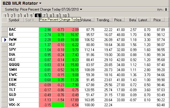
Monday, November 30, 2009

Monday VIXology

This week should provide a clearer view of the Dubai World default fallout. Based on the results of the latest VXX PDQ update the technicals are poised for further market weakness.
Note that most of the Long signals are 2 to 3 days old and the median N days value for the current longs is about 5, which means signal re-evaluation on Wednesday will be required in order to confirm VXX momentum.
The VIX has jumped ahead of the VXX since July, although the Stockcharts.com ratio study below suggests that, at least short term, the VIX may be due for a little pause. With a confluence of the charts now sitting near or dead on the (LR30) linear regression channel 30 day mean, mean reversion traders are looking for a bounce.
In the face of these mixed signals, Monday's momentum catalyst is likely to be news driven and risk adverse technical traders are best served by waiting for the trend to be more clearly defined.
Finally, I note without comment a little item in the Financial Times that traders at Goldman Sachs suffered only one losing day during the 65 business days of the third quarter. On 36 separate days during the quarter, the firm's trades netted more than $100 million each day.

Friday, November 27, 2009

VIXEN Meets Old Crow

It's always gratifying to know that somebody is actually trading the VIXEN setup and one of my loyal readers, Old Crow, has forwarded 2 of his recent forays using his own version of the setup.
As with all my VIXEN posts, Old Crow has shown these trades on the Schwab Street Smart Pro platform.
He uses a few more MAs than I prefer and has turned off the pivot points, but this is what works for him. It's always interesting (to me) to see how different traders adjust my default settings and indicators to create their own unique trigger perspective and risk control signals.
Old Crow uses a number of smoothed MAs, a resident feature of Schwab and has applied the signal line (the moving average component of the MACD) directly on top of the chart in lieu of placing it in a study window.
He retains the parabolics and in the examples posted it's easy to see that the SAR provides a consistently reliable trend reversal signals.

Wednesday, November 25, 2009

The VIXEN Four Faces

With yesterday's volume at about 60% of the daily norm I thought it might be a good time to review some of the basic VIXEN concepts and at the same time show the disparity between some of the large asset class ETFs relative to the VIX crosses.
Shown above are the NYAD, Qs, IWM and SPY. I could have shown the DIA, the VTI, the EEM, etc., but I leave that to you, gentle readers, in explore over your holiday.
What's of interest here is the relative performance of these 4 charts on the VIXEN cross.
The duration of each concurrent trade is shown with the red and green horizontal lines and the vertical white line. . . stats are as follows:
Qs . . +.3 %
SPY . . +.2%
IWM . . +.5%
NYAD . . +54%
Yes, a little breathtaking on the NYAD, but that's typical short term behavior characteristic of a rally. . in this case 60 minutes. Too bad you can't actually trade the NYAD. . but, like the VIX, it's a statistic, not an equity or derivative.
One of the reasons I never trade the SPY, or any of it derivatives is reflected in the relative performance of the SPY vs the IWM vs the Qs. There's just less momo, less beta, less volatility, less risk, but also less risk/reward.
This particular example is a bit peculiar as the ranking of volatility is typically Qs, IWM and SPY.
I suspect that recent higher volatility in the IWM can be traced to it's current lagging the other indices in new highs, with the result that bullish surges tend to favor the IWM as it tries to play catch up.

Tuesday, November 24, 2009

Facing the Music

Monday's PDQ forecast for a bullish VXX turned out to be a bit off. Actually the VXX did rise, (temporarily at mid-day) but that was after it had fallen almost 5% at the open.
OK . . , no excuses . . the VXX long signals were bad. In an effort to determine why, I went back and looked at each of the pair trade signals. Since the PDQ produced a mixed bag of signals, clearly there were some attributes of the correct signal pairs that need to be integrated into the incorrect signal pairs.


My investigation led to a continuation of my earlier post on the zero line rejection behavior of the z-score. While the Z-score rejection signal does offer a useful stop, the salient discovery that will first be integrated into the PDQ is a fixed time stop based on the optimized N day value for each pair.
I spent a few hours manually toggling through each of the PDQ Dashboard performance studies and virtually every one could be enhanced (some significantly) by applying this N day stop. Now these results are a bit surprising (to me) because it suggests that there really is a unique underlying timing cycle for each pair.
While this sounds deterministic, we need to factor in the all-important caveat that the PDQ model is designed to be adaptive and the N day cycle is really only valid as long as the equity curve of the pair trades remains positive.

Monday, November 23, 2009

Monday VIXology

Just off the cuff for Monday's VIXology the charrts look long the VIX and short the Qs. The VXX, the tradeable derivative of the VIX is a bit more ambiguous, which is reflected in the signal(s) currently being generated by the new PDQ Dashboard (Lite version).
The dollar is also looking bullish via the short term technicals, although we had a close call with the last UUP Dashboard BUY, so caveat emptor on this one and the wise course of action is to either 1. Stand back until an uptrend is actually confirmed or 2. Trade small and be ready to bail on a tight stop.
As mentioned above, my continued noodling with the PDQ has led me to evolve it's format into a Dashboard with 5 pairs rather than the original 8. Through on-going backtesting I've found that using the 5 highest linearity correlation pairs produces signals just as reliable as the 8 pair model with reduced noise.
I got a bit sidetracked last week on some new refinements of the PDQ including the zero line rejection signal and never got around to the VXX/UUP study I promised earlier. I'll rectify that delay this week and also show some graphical studies of a pairs trading model that will, I venture to say, give credence to the old adage that "a picture is worth a thousand words."

Friday, November 20, 2009

Qs VIXEN

Here's another example of the VIXEN setup, this time using the Qs as the underlying. With the NYAD in a VERY slow ascent (.09 total rise) as of one hour pre close, there were still a few bucks to be pulled out of the Qs using the VIXEN.
I'm not showing the NYAD chart today as the % change was so small as to be barely noticeable and effectively untradeable.
Although these 5 trades only netted $ .11, .16, .12, .11 and .06 respectively, the total gain over a 4 hour span was $.56 (- commissions), a respectable return IMHO considering the total range of the Qs is currently $.75.
The VIXEN produced a very nice ride from 11:00 to 12:30, and when that trade reversed it looked like the 11:00 lows might be revisited. The turn at 13:30 demonstrates the utility of confirming signals as the parabolics fired a BUY (or cover) and the 3 MAs turned upslope.
Readers who clued in on the SMA8 high and low channel that I mentioned earlier can also see how the channel crosses helped signal trend change.

Thursday, November 19, 2009

More on NYAD / VIXEN

This is a little variation of a setup I previously profiled using the VIX and NYAD to signal trade entries and exits in GE. The setup works for a variety of underlying stocks and/or ETFs, although the large caps and the indices seem to work most consistently.
I like GE because it mimics the overall market so well while at the same time displaying a beta that makes it trade more like a Proshares ultra than a stock. I also like the penny option spreads and the huge open interest across a long option chain given the fact that this is a $16 stock.
What's different about this setup is that instead of looking at parallel GE charts, we looking at the VIX crosses on GE (or your choice) and on the NYAD. You would intuitively think it was important to keep the underlying target a vehicle that's convergent with the major indices and not something like the UUP, which is divergent, but the simple remedy for that problem is to make the VIX the underlying on right chart with the NYAD as the overlay.
These setups can provide great little intraday scalps with the caveat that you always need to have one foot out the door in case things go awry.
There was some ambiguity in the underlying technicals on the NYAD/VIX chart (red circle) which will now prompt me to review and retest those indicators prior to future trades.
*
Finally, after over 3 years of daily posting on this blog I've decided on a new visual clue to reflect my attitude towards the markets. Gone is Homer's Scream, now replaced by a photo of my humble support team. . . Lopaka, Wilson and Tonto.